
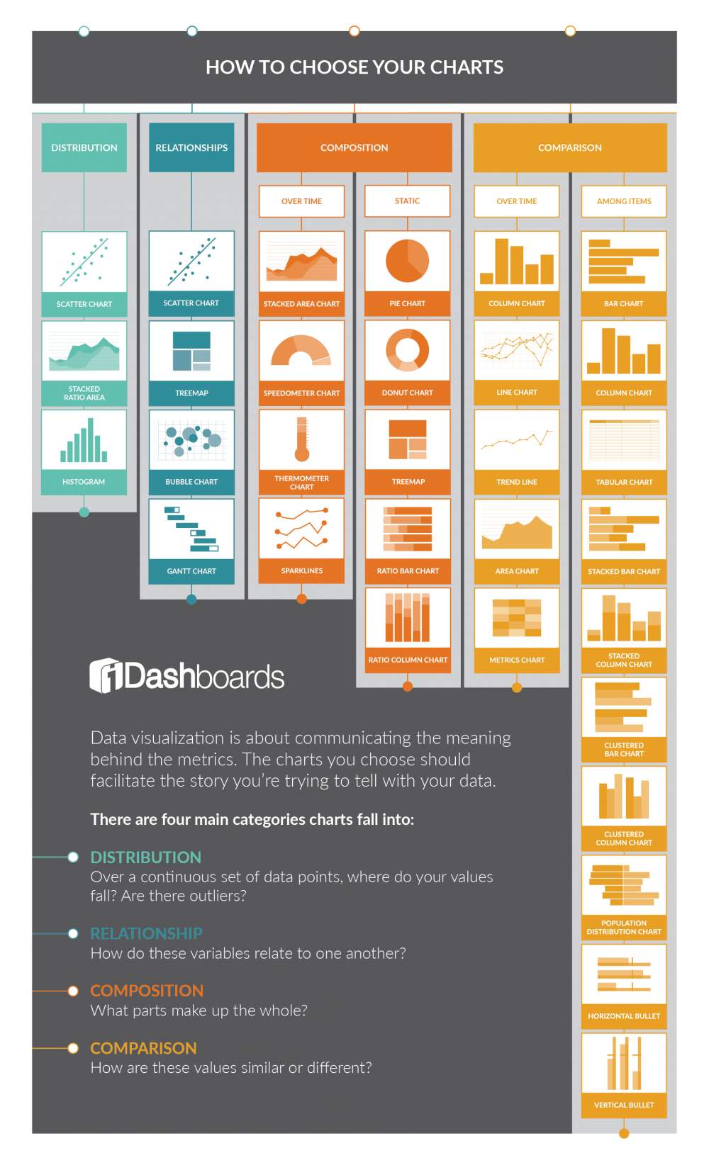
Creating a unique and engaging data visualization starts with choosing the right charts and graphs to facilitate the story of your data. However, this is not an easy task. With so many different chart types available, how can you be sure that you are selecting the right one? This infographic, “How to Choose Your Charts,” was designed to help you learn all about the different chart types and categories, so that you can make an informed decision.
Let this infographic guide you towards the chart types that make the most sense, whether you are trying to show the distribution, relationship, composition, or comparison of data. It also helps you determine the best chart types for showing data over time or among items. If you use the right charts, they can help set the stage for your data story and positively impact the way you and your audience understand the data.
Infographic Source: https://www.idashboards.com/blog/2018/12/10/infographic-how-to-choose-your-charts/